THE CHALLENGE
The goal of this project was to improve the off-boarding process in order to reduce risk to the department, create efficiencies in process and make the experience more user friendly.
Under the existing system, line managers were burdened with multiple separate and asynchronous tasks, leading to significant inefficiencies. On average, it took approximately 26 hours for a line manager to off-board an employee who was leaving, causing anxiety and confusion as they juggled multiple responsibilities alongside their daily workload.
The original leaving process created a lot of risks including:
overpayments resulting from incomplete off-boarding before payroll cut-off dates
laptops, mobiles and passes not returned in good time
continued access to tools and services
lack of data about leavers and the actions taken to ensure their complete off-boarding from DBT tools, services and products.

MY CORE ROLE & RESPONSIBLITIES
As the interaction & service designer I was responsible for
prototyping and iterating screens based on user feedback
leading on the design of case working system for our internal teams and stakeholders
mapping the journeys of user groups across the service to ensure consistency across the service
presenting prototypes and service blueprints to stakeholders to gain support and validate workflows
THE APPROACH
I joined the team as they were going into private beta, and lead on the design through to the service going live. During discovery, the team interviewed 26 stakeholders and internal users to discover pains and needs related to as-is leaving processes.
In alpha, they had made the decision to the flip the onus onto the leaver, who would provide the necessary information once, and then the service would contact the relevant parties on their behalf. When I picked up the project, the team had a fully working, API integrated, code version of the form for the most straight-forward type of leaver: someone who is leaving the civil service.
Service Blueprinting

Upon joining the team, familiarising myself with the service proved challenging. A few weeks in, I stumbled upon a dated service blueprint from the alpha stage that no longer served its purpose. This blueprint was excessively technical and lacked usefulness for any specific stakeholder group, attempting to cater to all needs without success.
To rectify this, I redesigned the blueprint, streamlining it by removing intricate technical details. The goal was to make it more accessible and readable for non-technical stakeholders, ensuring a clear overview of the service’s purpose and how it would work in practice.
As the service continued to develop and encompass more user types, such as those retiring and transferring to other government departments, I presented the updated blueprints to our HR stakeholders. This was to ensure that the correct processes would be actioned in the new service workflow and that all stakeholders were aligned on how the service would work.
TrANSFERING TO ANOTHER GOVERNMENT DEPARTMEN

Whilst the team had a functioning MVP for employees resigning from the civil service all together, 80% of people who would use our service were transferring to another government department.
This opened the door to a whole new set of complexities, as any solution we devised had to adhere to the cross-government transfer process governed by the Civil Service Employee Transfer form (CSET). Unfortunately, the CSET was a lengthy spreadsheet-based process with numerous pain points, but we were determined to find a way to work with it effectively.
Our first option involved replicating part of the CSET form in GDS compliant webform. Upon submission, users would be able to download the spreadsheet with the provided information. Our vision was to create a more accessible and user-friendly experience compared to the traditional spreadsheet approach. Additionally, we aimed to pre-populate certain fields with data already available in our system, a practice that would grow in importance as we moved towards a unified login system.
The second option was separating the CSET form from our off-boarding tool entirely, providing lots of guidance on when our service should be used instead. The benefit here was that this would allow us to not be dependent on any future changes to the CSET process.
To facilitate decision-making, I developed two clickable prototypes representing the journey of the user for each option. While we were unable to conduct user testing at that time, the prototypes proved immensely valuable during internal discussions. By presenting tangible examples to the team, we were able to discuss and evaluate the merits of each proposition effectively, ultimately deciding the value added for the user by option 1 would not outweigh the massive risks in developing it.
Designing for internal stakeholders
When I joined the team the leaver-facing form had already been through a fair amount of iterations.My primary focus was to design the interfaces for our internal teams - security, SRE, and HR - who played a crucial role in logging information into our system. Collaborating with these teams allowed us to test and iterate quickly.
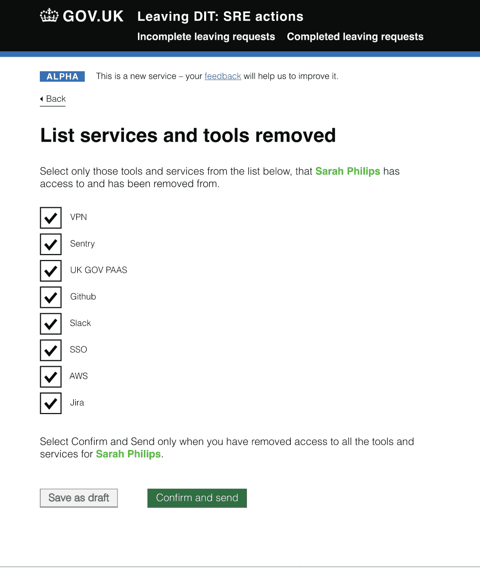
For example this part of the service allows the SRE team to record which services they have off-boarded a Leaver from. This is important as accidentally leaving leavers with access to tools upon leaving wastes licensing fees and makes DIT vulnerable to sensitive data breaches.
The journey begins with SRE receiving an email, which notifies them the leaving date and provides a link into the service.
The initial design provided the user with a serious of checkboxes, which they would tick to indicate they had removed a leaver from that service. They could save the list as a draft or mark it as complete.
First iteration of SRE interface

Final iteration of SRE interface
We conducted 1-2-1 usability testing sessions with the SRE team in which we focused on understanding the users end to end experience.
Users want to check what tools and services a leaver has access to so that the time it takes to off=board is reduced and greater confidence in a complete off-boarding can be achieved.
Users want to provide full confirmation of actions so that it it clear what actions have been taken and who by.
Users wanted to be able to work in a flexible way so that they can easily switch attention between tasks and come back to the leaving request at a later date to pick up where they started.
In response to the user research findings, I introduced a task list that provided detailed information for each service. By incorporating a status indicator, users could track their progress with ease, making it convenient to save and resume their work. The task list also displayed the latest action or note, enabling quick identification of who performed specific actions and when.
Since showing only the services the user was registered for was not possible due to the lack of relevant data, we decided to display all possible services. This approach prompted the SRE colleagues to thoroughly review each service before confirming the off-boarding process, ensuring a complete and thorough outcome.
GOING LIVe

After the service was launched, we handed it over to our HR stakeholders. Over the following months we fined tuned the service in response to user feedback.
One particular issue was that employees didn’t understand that the onus was now on them to complete the process rather than their line manger. This was explained in the guidance on the intranet and on the start page - but the old adage ‘users don’t read’ was certainly true in our case. We had multiple problems with line mangers trying to complete the form on behalf of someone else and this was causing major problems.
Our first instinct was of course to improve the content, make it clearer who had to complete the form. But given the severity of the consequences I didn’t think this went far enough, instead I suggested that we add a new screen to the flow. So that the first question after clicking start is asks the user if they are leaving or if they are completing this form on behalf of someone else. If they select the latter, they are directed to guidance on what to do instead.
Reflection
This was my first project in the civil service. It was a learning experience since my previous work was more client centred, rather than user centred. However, this was precisely what drew me to this job in the first place, I admired about the UK Government’s approach and their dedication to the user-centred design process. It was also my first experience of working in an Agile team, so in between I was also learning how to navigate the world of sprints, standups, retros and backlogs.
Through collaborative efforts and iterative improvements, we successfully enhanced the off-boarding process in the department. The new Leaving DBT Service has reduced the off-boarding time from 26hours to under 10 minutes; so line managers have more time. DBT also benefits by having a live audit trail of leaving events available for reporting and analysis at any time. This gives planners real-time insight that translates into better workforce planning and budget management.